WORK180 · Product Designer · 2026
Product Design UX / UI Brand

Knack:
Apprenticeships, matched

Designing a two-sided apprenticeship platform from a blank page to launch in three months. The product helps young people find a trade that fits them, and helps employers find candidates who know what they're signing up for.
Role Sole Product Designer
Year 2026
Tools Figma · FigJam · Claude Code · Vercel
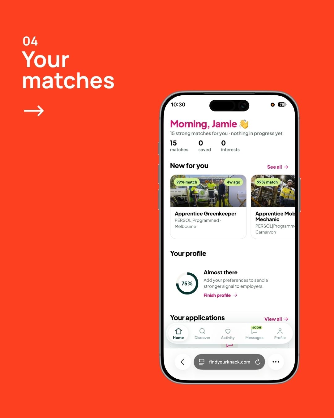
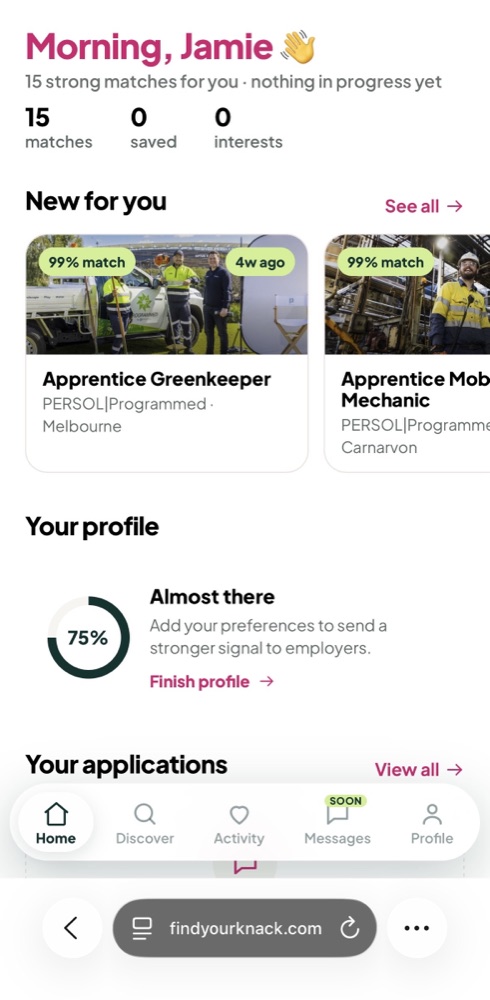
Knack home screen showing new matches
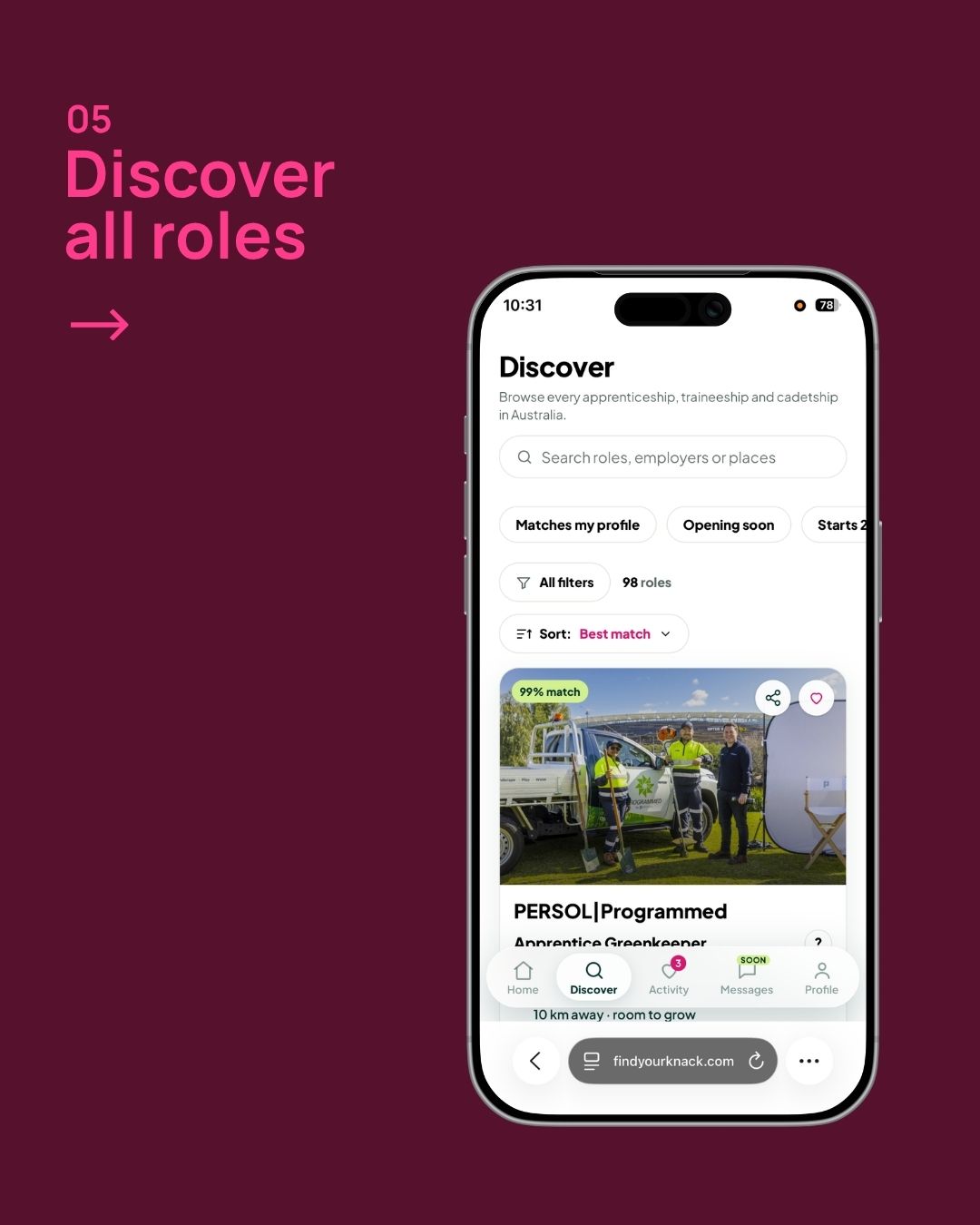
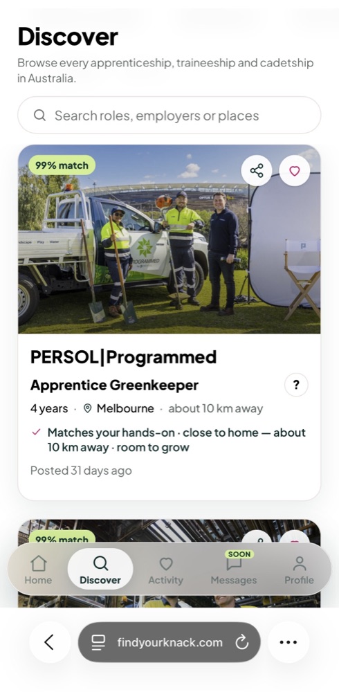
Knack discover screen with a 99% match role
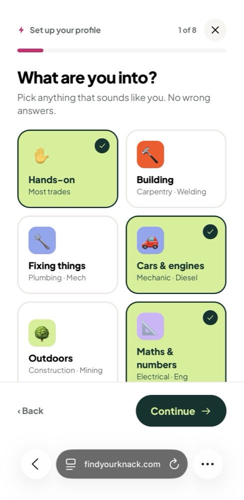
Knack onboarding: What are you into?
Overview

The challenge

AI is closing off the entry-level office jobs that used to give young people their first step into work. Meanwhile, trades and care roles can't be filled. The channels employers use to recruit apprentices were built for adults with CVs, not for a 17-year-old who doesn't know what being a sparky actually involves.

Knack started as an experiment with almost no runway. I had one week to put a working prototype in front of a potential client, and three months to launch a new brand, a mobile web app for young people and a self-serve dashboard for employers. Because it was an experiment, every stage of the build had to prove the product was worth continuing.

Research

Two things we had to prove

This was a two-sided bet, so we needed evidence from both sides before investing further. These weren't just UX questions. They decided whether Knack had a business.

Proof 1
Would young people actually sign up?

Before we built the full product, we launched a waitlist with a short questionnaire. Our goal was 2,000 sign-ups before launch, and we reached 4,340, more than twice the target. That showed real demand from young people.

The questionnaire also meant we could preload their answers at launch, so they could confirm their details instead of starting from scratch.

Proof 2
Were employers' pain points real, and could we solve them?

I ran discovery conversations with 10 employers across mining, aviation, energy, defence, transport and logistics. Despite very different industries, the same problems came up again and again:

  • 8 of 10 said candidates start without understanding what the role really involves, and early drop-off follows.
  • 6 of 10 are overwhelmed by applications but struggle to find the right people.
  • Most struggled to get women to apply at all, with some customers seeing 10% women applicants against targets of 30 to 50%.

Volume was rarely the problem. Fit was. That changed what we built: Knack became a quality-over-quantity matching product instead of another job board.

Process

How I approached it

As the Lead Designer, I led Knack from discovery through to launch. I worked closely with engineering, product and our sales team, and I mapped both sides of the product in parallel.
Discovery
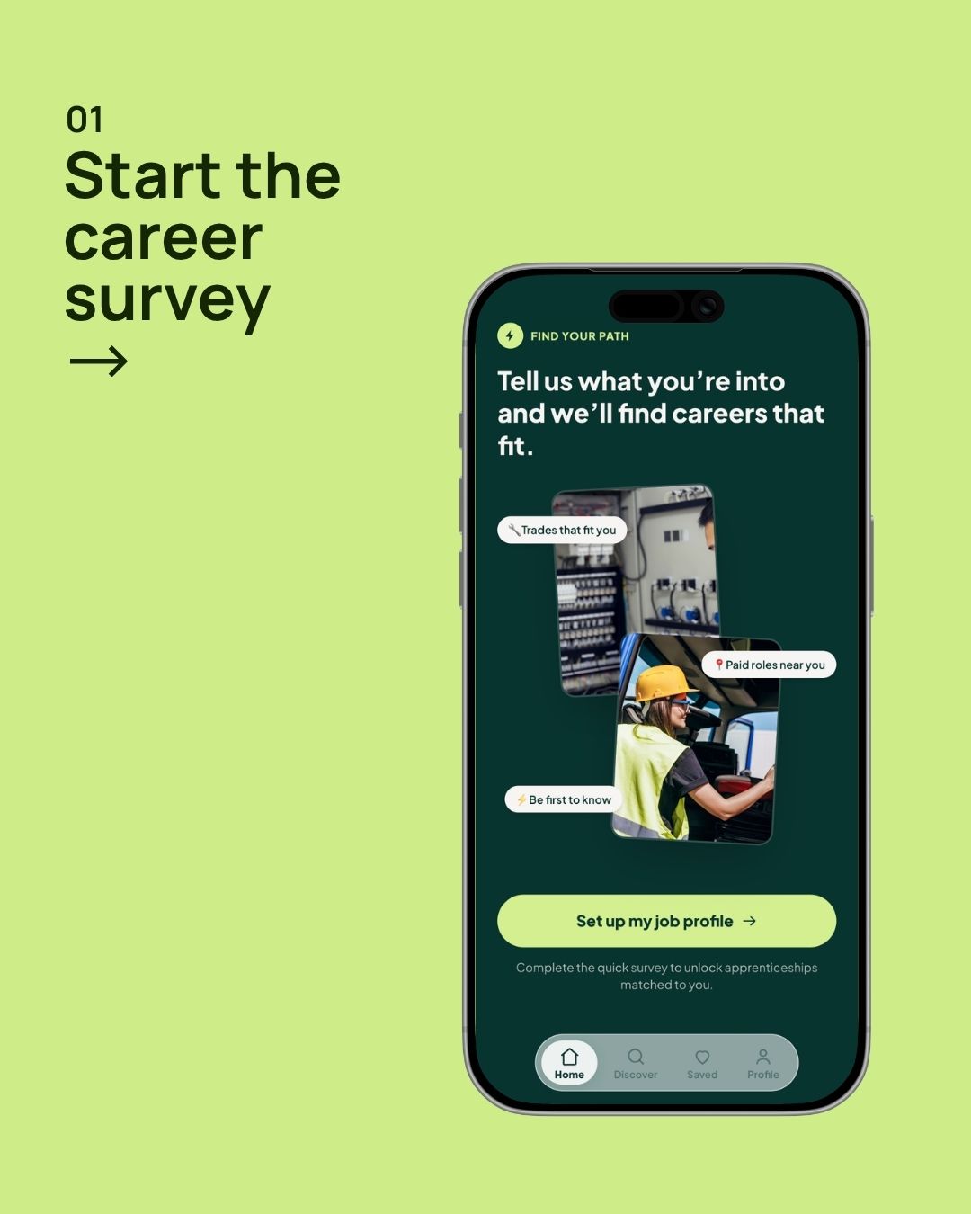
Ran employer interviews and used the waitlist questionnaire to understand young people. I turned both into personas and jobs to be done for each side.
Scoping and prioritisation
Made fast calls on what to build for launch and what to deliberately park, such as in-app messaging, native apps and CV upload. This kept the MVP focused on discovery and matching.
AI-assisted prototyping
Built working prototypes with Claude Code and deployed them to Vercel to test real interactions. This got a working prototype in front of a client in the first week and gave engineering a head start.
Brand and landing page
Created the Knack brand and the waitlist landing page, then carried the same visual language through both products.
Candidate and employer experiences
Designed a mobile-first web app for young people and a self-serve dashboard for employers. Both use the same vocabulary, so what an employer writes is exactly what a candidate reads.
Collaboration and launch
Worked through trade-offs with engineering using evidence rather than opinions, and set up week-on-week metrics so we could measure the experiment from day one.
Key features
Scroll to explore
01
The honest preview
This came from the most requested "magic wand" in our employer interviews. Every role shows the good parts, the hard parts, and what surprises people, so candidates can decide for themselves before applying.
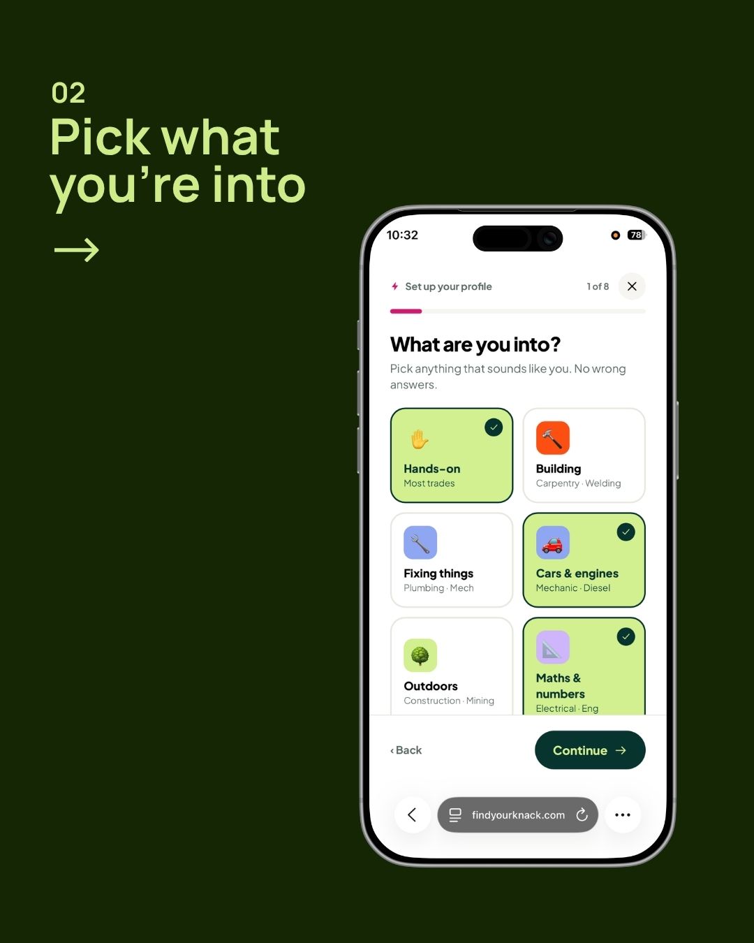
Knack onboarding: What are you into?
02
Interest-led onboarding
Candidates start with what they're into and where they live, not a job title or a CV. They also tell us their deal-breakers, so we never show them roles they'd hate.
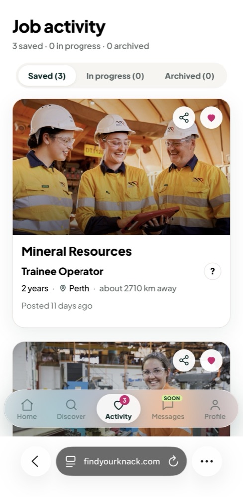
Knack job activity tracker
03
The fit verdict and application tracker
Candidates get an honest read on how well they match, and they can follow every application through five clear stages so no one gets ghosted.
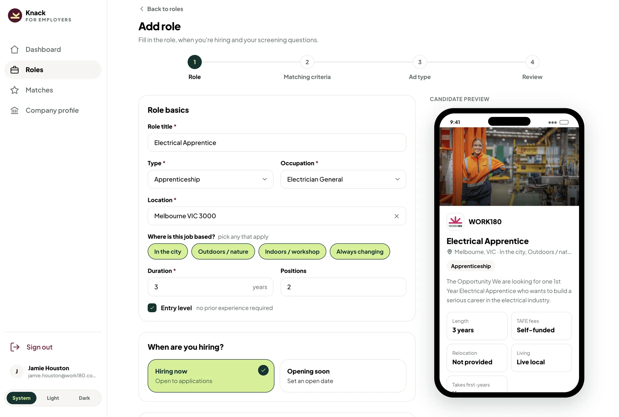
Knack employer dashboard: add role with live candidate preview
04
Self-serve role builder
Employers post a role in four steps, with a live preview showing exactly what candidates will see on their phones.
Outcome and impact

What I delivered

Knack went from a blank page to a launched product in three months. That included a new brand, a landing page, a mobile web app and a self-serve employer dashboard. The experiment has already validated demand on both sides, and revenue is starting to flow.
0
Young people on the waitlist before launch
↑ More than 2x our goal of 2,000
$0k
Annual recurring revenue in the first 21 days
↑ $20k week on week
0
Job ads live from 128 employer profiles
Plus 13 pledge partners
Early weekly signals, three weeks after launch
914job views↑ 224 week on week
44applications and apply clicks↑ 26 week on week
85candidate accounts↑ 40 week on week
The app
01 Start the career survey
02 Pick what you're into
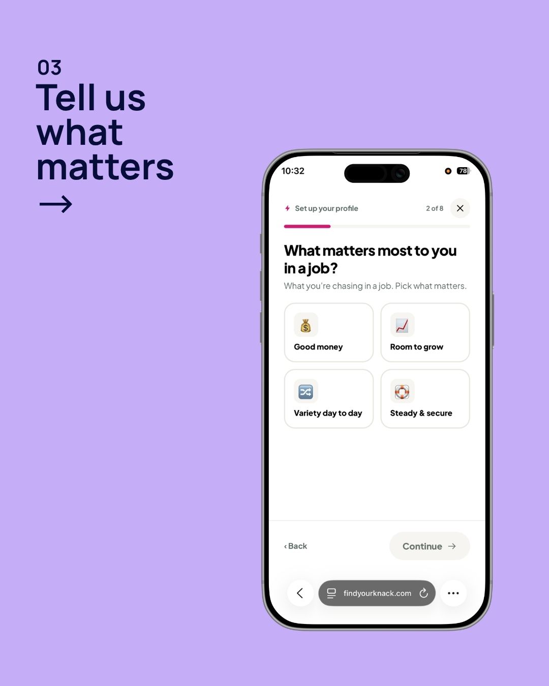
03 Tell us what matters
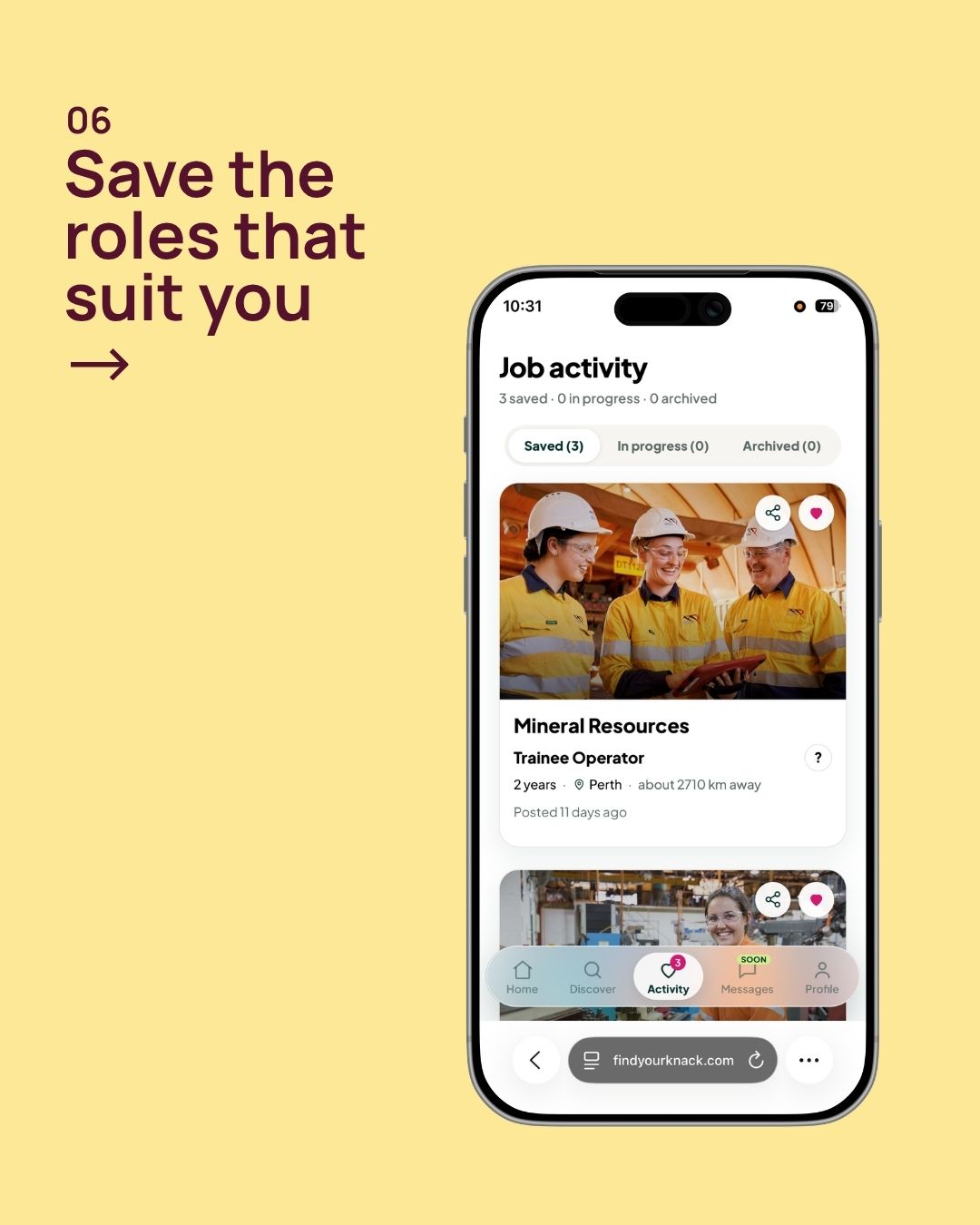
04 Your matches
05 Discover all roles
06 Save the roles that suit you
Takeaways

Key learnings

01

Time the waitlist to the launch

The waitlist proved demand, but conversion into the app hasn't been good so far. We started the waitlist too soon and kept paid spend running after we hit 2,000, and from the results I suspect much of it has gone cold. Next time I'd stop paid spend once we hit the goal and start it again when the product is live.

02

Lock the brand before launch comms

Knack started under the WORK180 brand. The new name was agreed two weeks before launch and the brand was created one week before, which meant a new domain for emails. Those emails landed in people's spam and promotions folders. Settling the name and domain earlier would have avoided this.

03

Set up the AI workflow first

AI is great for speed and for getting prototypes out, but it does get things wrong. Fixing those mistakes cost us more time and credits than setting up our workflow properly from the start would have.

Next steps

Scaling the experiment

Now that employers can self-serve, the sales team is ramping up outreach this month. The pipeline already includes several large national employers. The company goal is $1M in revenue from Knack by the end of the financial year.

On the product side, I'm focused on bringing more of the waitlist into the app, re-engaging candidates when new matches or employer interest come in, and adding self-service payments. We're tracking every change against our weekly metrics.

Quick Interview
Common questions recruiters ask.
Click any to see my answers instantly.

I'm a product designer with 10 years across freelance, in-house, and startup environments. My background spans product strategy, UX research, UI design, branding, and illustration so I can carry an idea from a whiteboard conversation all the way to a shipped, on-brand interface.

I'm currently a Product Designer at WORK180 in Melbourne, working end-to-end on the employer-facing platform from discovery and research through to delivery and iteration.

Because I don't just design screens I think about outcomes. I started in visual and brand design, which means I care deeply about craft and polish. I grew into UX and product, which means I care about whether it actually works for people and moves the business.

I'm also fluent with AI-enabled workflows and front-end enough to communicate precisely with engineers. I move fast without dropping quality, and I thrive in teams where design and engineering are genuinely collaborative.

Discovery first I want to understand the problem, the users, and the constraints before I sketch a single screen. That means research, stakeholder conversations, and auditing what already exists.

Then I move fast in low-fidelity: flows, rough wireframes, quick prototypes for testing. High-fidelity comes after we've validated the approach, not before. And I stay involved post-launch data and user feedback inform the next iteration.

As a partner, not a handoff machine. I try to involve engineers early ideally in problem framing so they're invested in the solution, not just implementing a spec.

I'm comfortable reviewing implementations for design fidelity and adjusting specs when engineering constraints make something impractical. I'd rather ship something slightly simpler and well-built than something pixel-perfect and brittle.

The challenge
We identified an opportunity to help young people find the right apprenticeship path with full transparency, while giving employers a way to manage applications on the other side. The tricky part was that it's a two-sided product with very different user needs, and we jumped straight into it as an experiment with almost no runway. I had a week to show a working prototype to a potential client, starting from scratch.

What I did
I ran discovery and scoped the project myself, mapping out both sides of the experience simultaneously. I had to make fast, pragmatic calls about what to explore and what to park, and built the prototype end-to-end to get something tangible in front of stakeholders quickly.

How it evolved
The whole process has been learning while building, taking feedback from research and changing direction based on what we found rather than following a fixed plan. That's been the real design challenge: staying structured enough to make progress while staying loose enough to respond to what we learn.

Where it landed
We're currently in validation with some strong early signals. It hasn't shipped yet but the process itself validated a lot of our assumptions about what both sides of the market actually need.

Range, and where I sit between disciplines. I started in visual and brand design, so I have a strong eye for typography, layout, and polish but I grew into UX, design systems, and front-end, so I can carry an idea from a stakeholder conversation all the way to a built, accessible, on-brand interface.

That blend matters for work that lives between marketing, communications, and product. I'm also a systems thinker who still sweats the pixels.